
FreshCart-Grocery Shopping Simplified
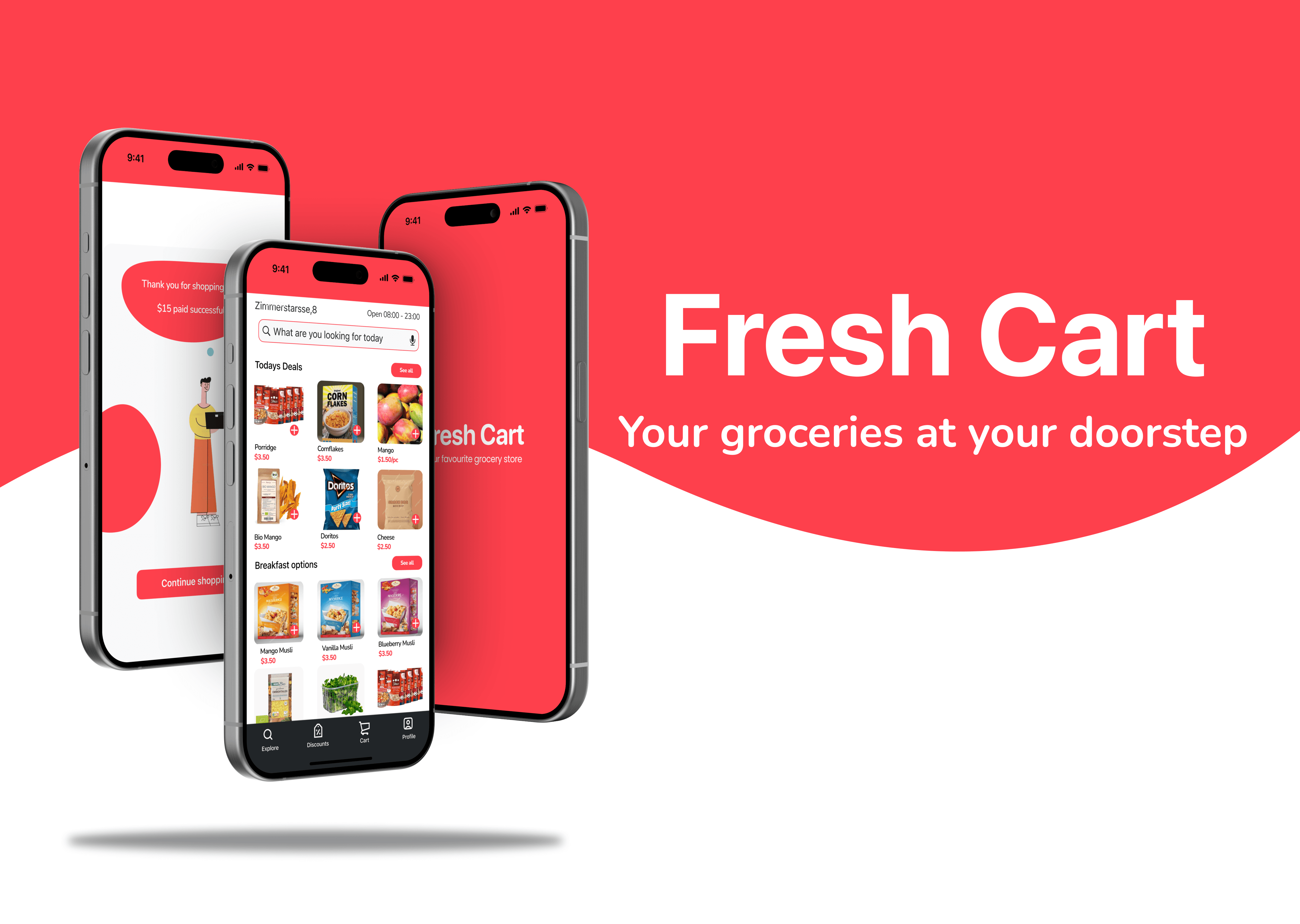
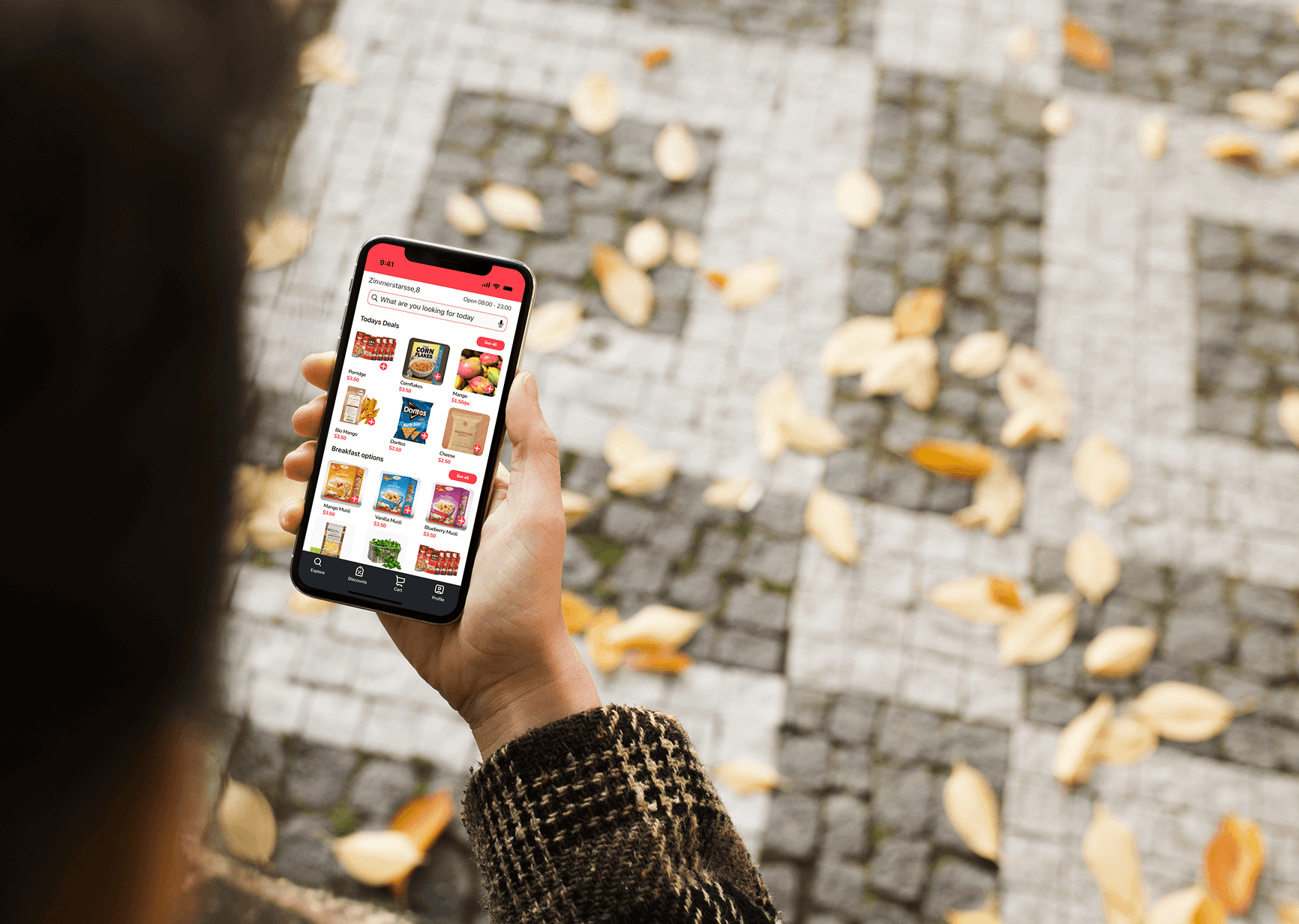
Fresh Cart is a grocery delivery app designed to simplify the process of ordering groceries online. Fresh cart aims at delivering the groceries at the users doorstep within an hour of placing the order. With a focus on intuitive user experience and seamless interactions, FreshCart aims to provide users with a convenient and enjoyable way.
The app was designed after thorough user research that helped understand the pain points users faced while working with existing e-commerce apps. The insights were translated into a streamlined interface with optimised visual hierarchy, frictionless UI components, and goal-driven microcopy.
By streamlining the login process, optimizing intuitive navigation, and simplifying the payment journey, this project enhances user accessibility, reduces friction, and drives higher conversion rates. Users experience faster access, effortless product discovery, and seamless transactions—minimising drop-offs and boosting completion of purchases by 20-30% while fostering trust and satisfaction.
E-commerce
UI/UX Designer
Platform
iOS and Android
Tools Used
Figma
Challenge
The existing grocery delivery apps in the market take at least three days to deliver and often suffer from cluttered interfaces, slow loading times, and complicated navigation, leading to a frustrating user experience.
Fresh Cart aims to address these issues by offering a quick delivery system with a streamlined and user-friendly interface that enhances the overall ordering process.
Possible Solution
The goal of Fresh Cart is to revolutionize the grocery delivery experience by delivering the goods within an hour of placing the order, providing a streamlined, intuitive, and efficient platform for users to order their groceries.
Key objectives include:
Simple and quick Login process to improve accessibility.
Intuitive navigation and categorisation of products.
A clear intuitive and simple online payment process with less distractions making sure the user completes the process.
Ultimately, Fresh Cart aims to become the preferred choice for grocery delivery services.

Design Process
Research and Analysis
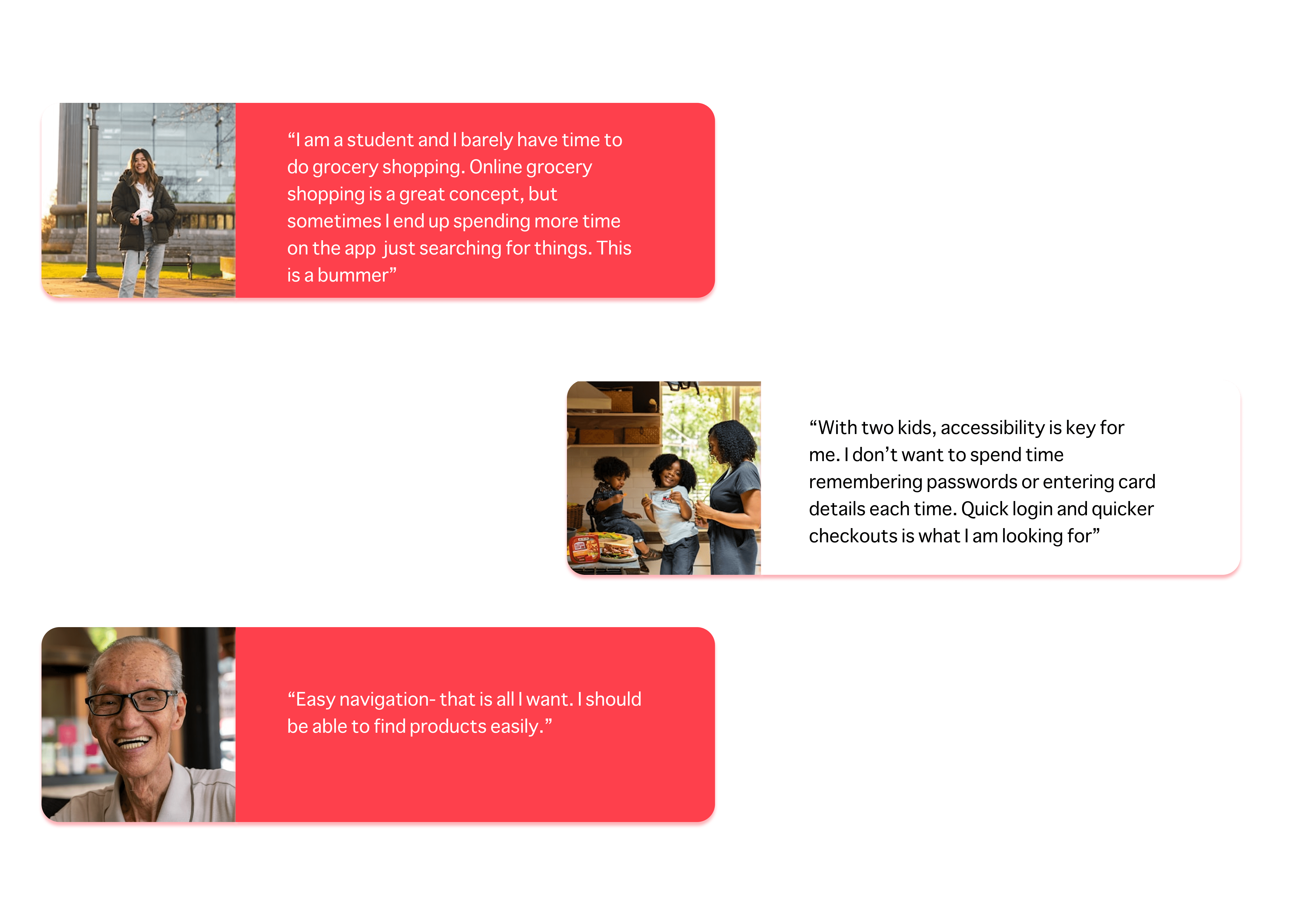
Understanding the user needs and pain points is a crucial part of user research. I conducted user interviews and surveys to capture a clearer picture and also analysed two competitor apps to gather more insights. Let's take a look at what users had to say.
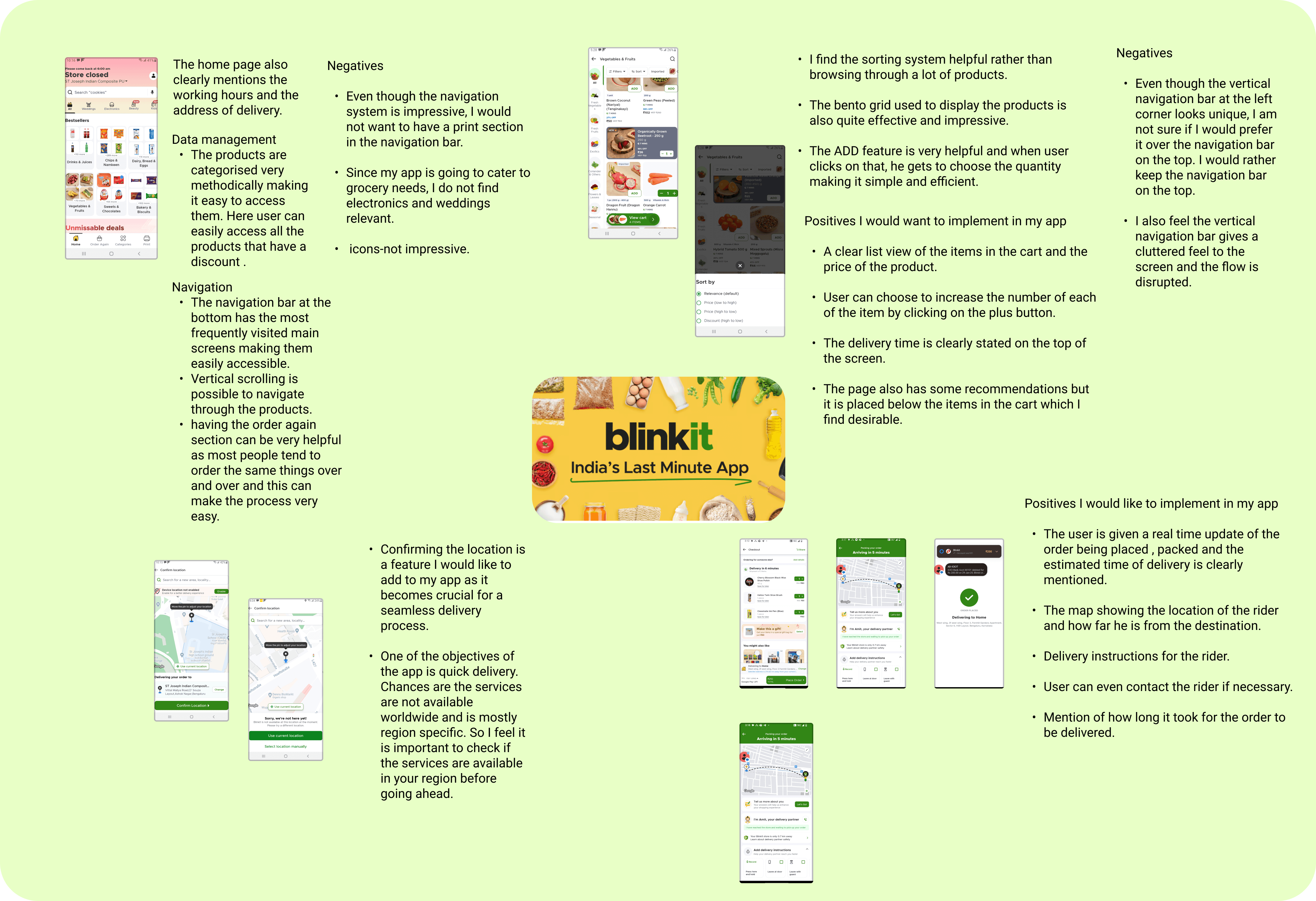
Competitor analysis
I conducted competitor analysis of two popular and successful grocery apps to understand market trends better. Here is a glimpse of some notes I made in the process.

Findings
I compiled my findings into patterns, surprises, frustrations and needs.

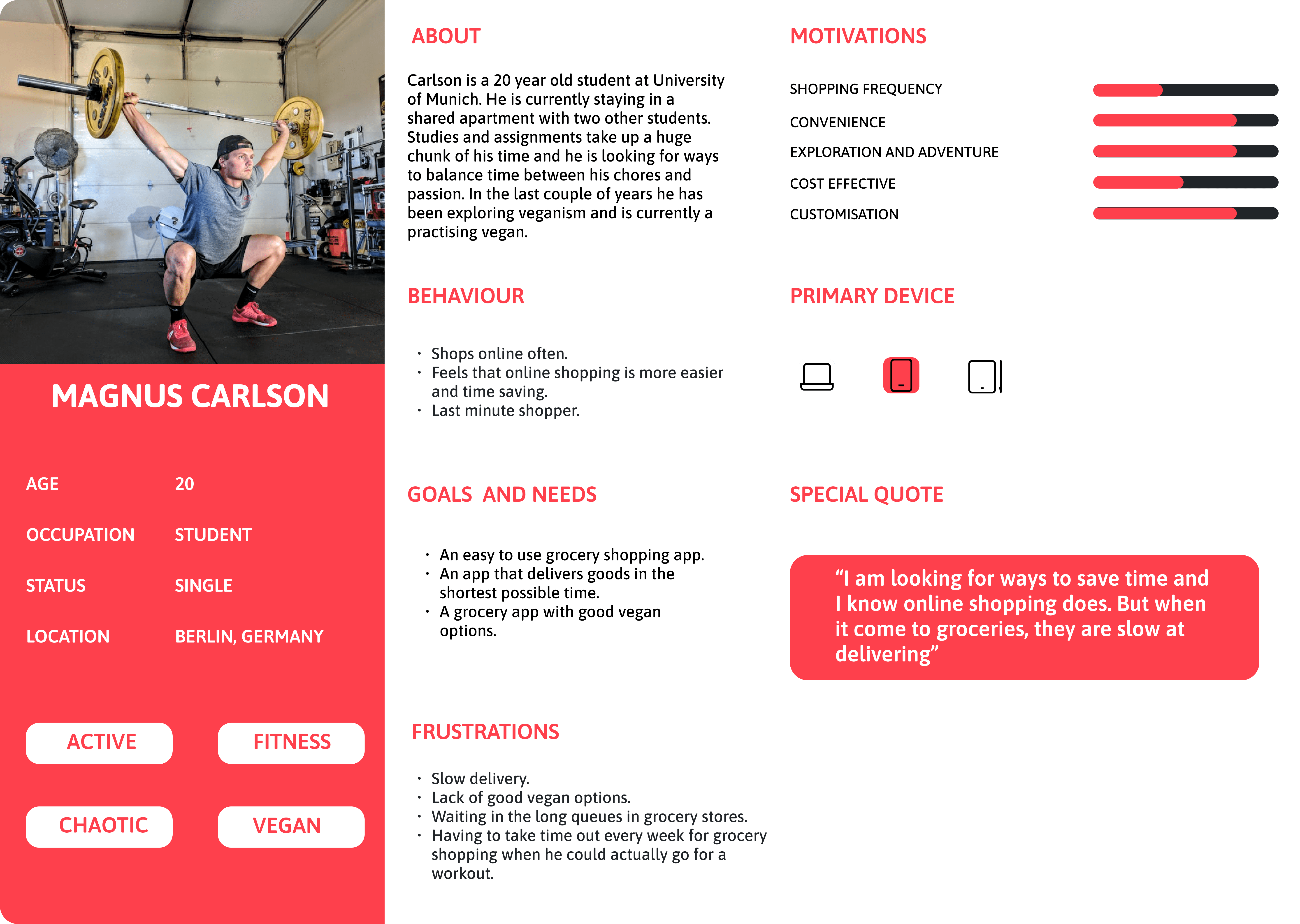
User Persona
With all the information from the research and competitor analysis, I went ahead and crafted a couple of user personas

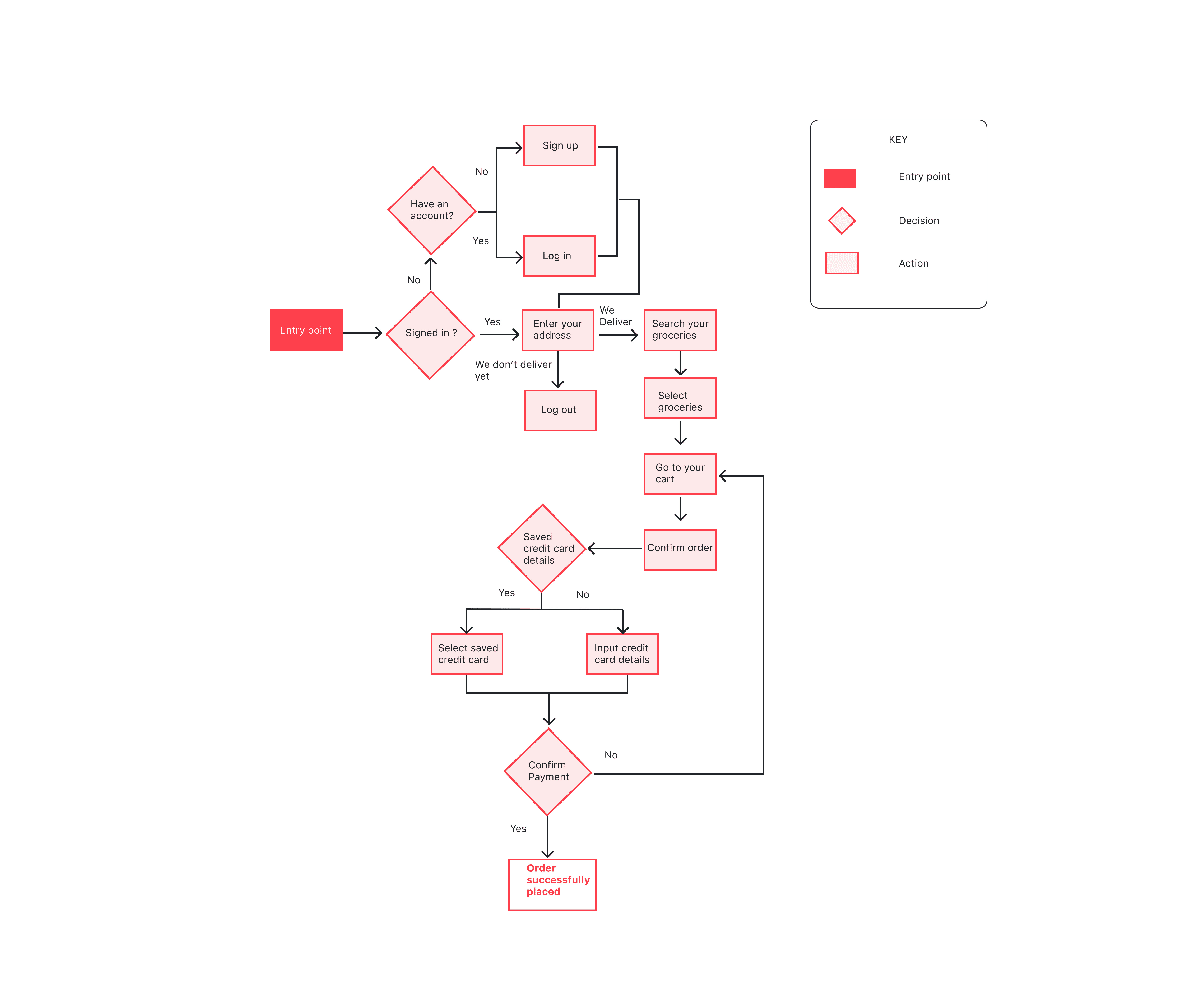
User Flow
I mapped the user journey into a simple user flow diagram.
Sketches And Low Fi Wireframes
Let me walk you through the initial sketches and the low fidelity wireframes. My goal at this stage was to diverge first, considering various possibilities and converge later.


Low Fi Wireframes for iOS

Low Fi Wireframes for Android

Style Guide
The visual appeal plays a big role in the apps acceptance. I always work my way up from a mood board to framing the brand guidelines. In this case I wanted to have a minimal approach so that the interface does not overwhelm the user.

Usability Testing
It is best we fail fast to learn faster. I conducted user testing with 5 users using the survey format to understand how the users found the app. The feedback was collected, classified based on priority and iterations made before another round of user testing was conducted. Users could effectively complete the task at a much faster pace and the drop-offs reduced by 25 %.
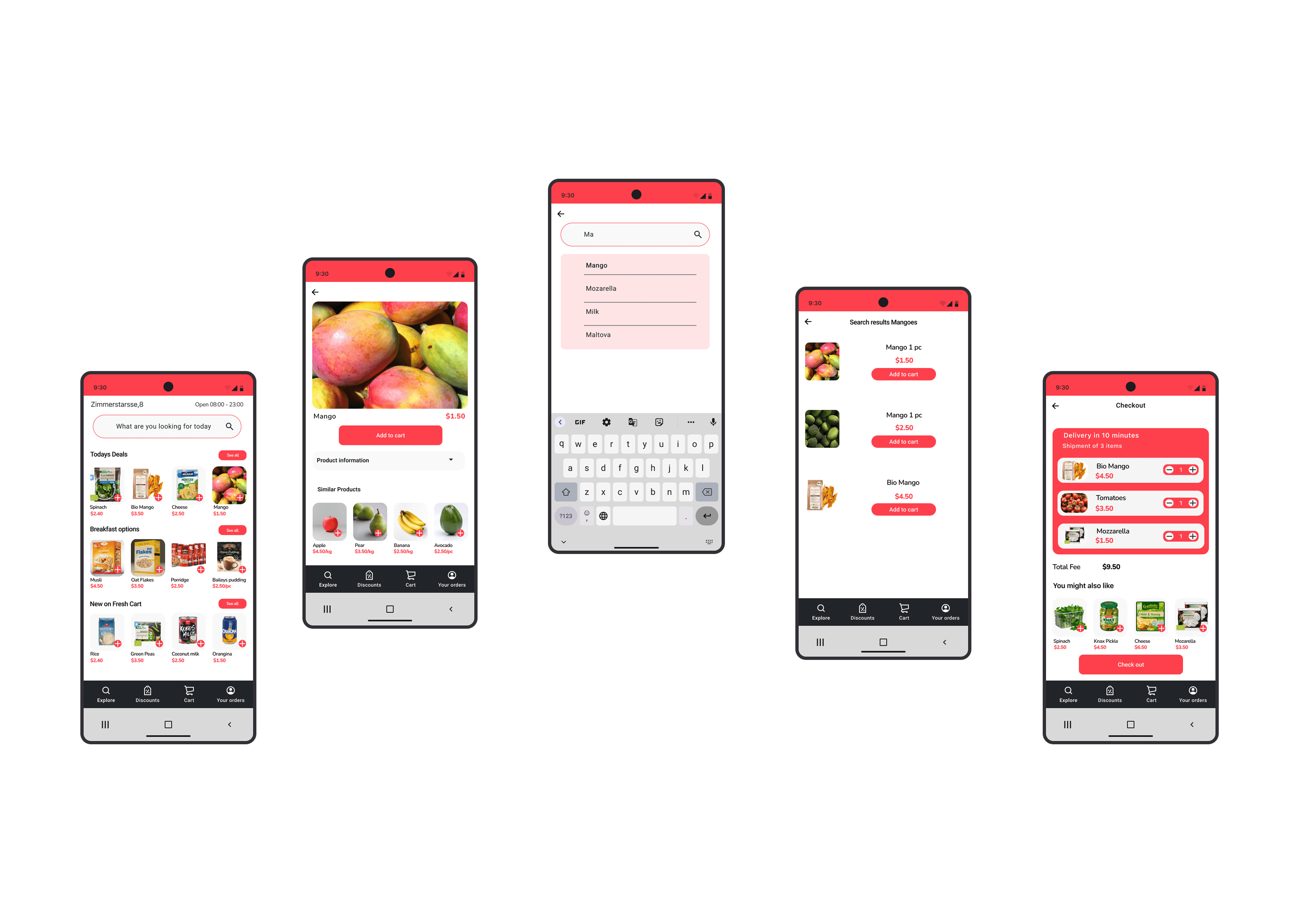
Final Designs- High Fidelity Wireframes
Let's now take a look at the final outcome. The designs were made for both iOS and Android devices adhering to the respective design guidelines.
High Fidelity Wireframes- iOS
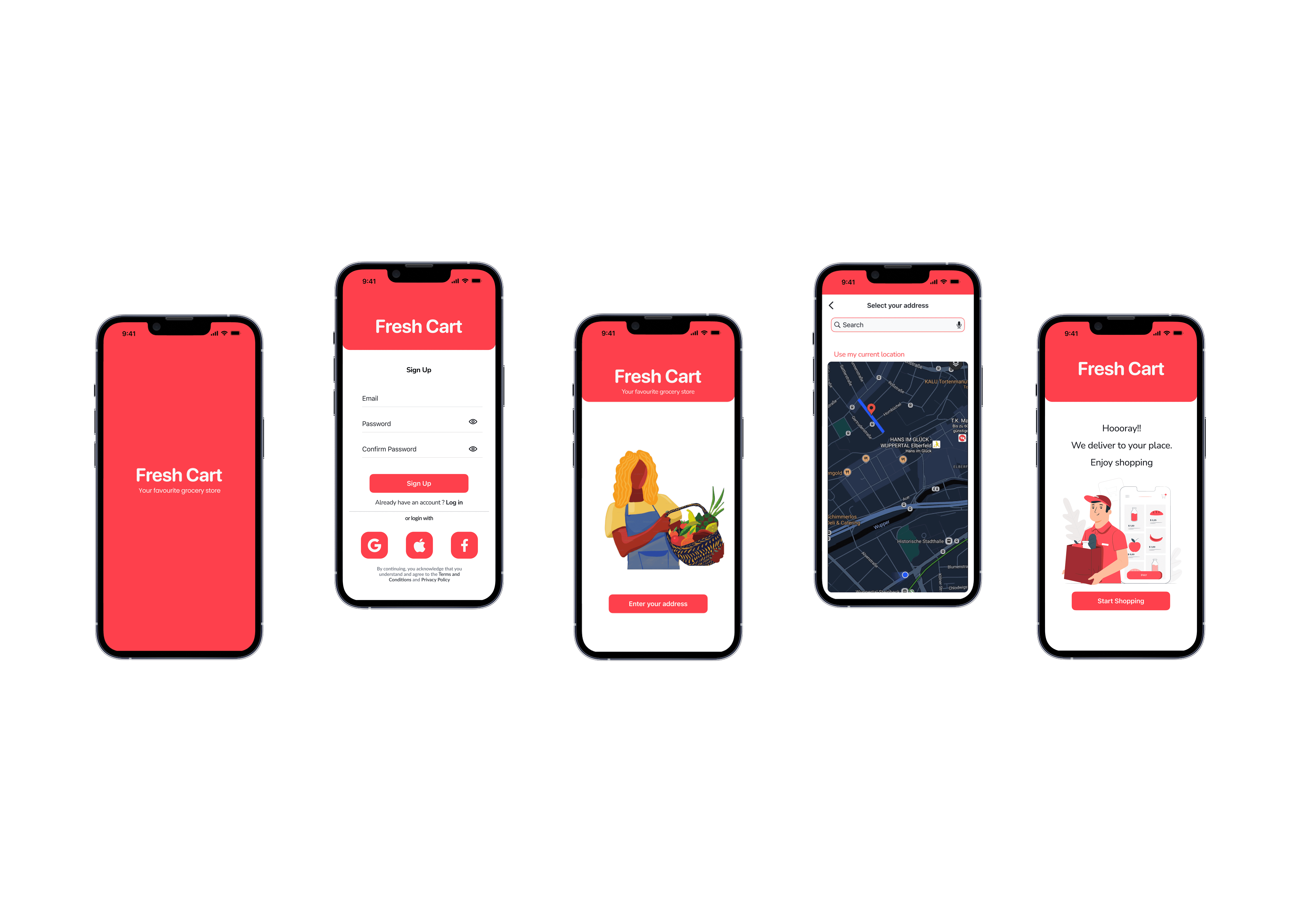
Signing Up to FreshCart
Adding items to cart

Adding payment method
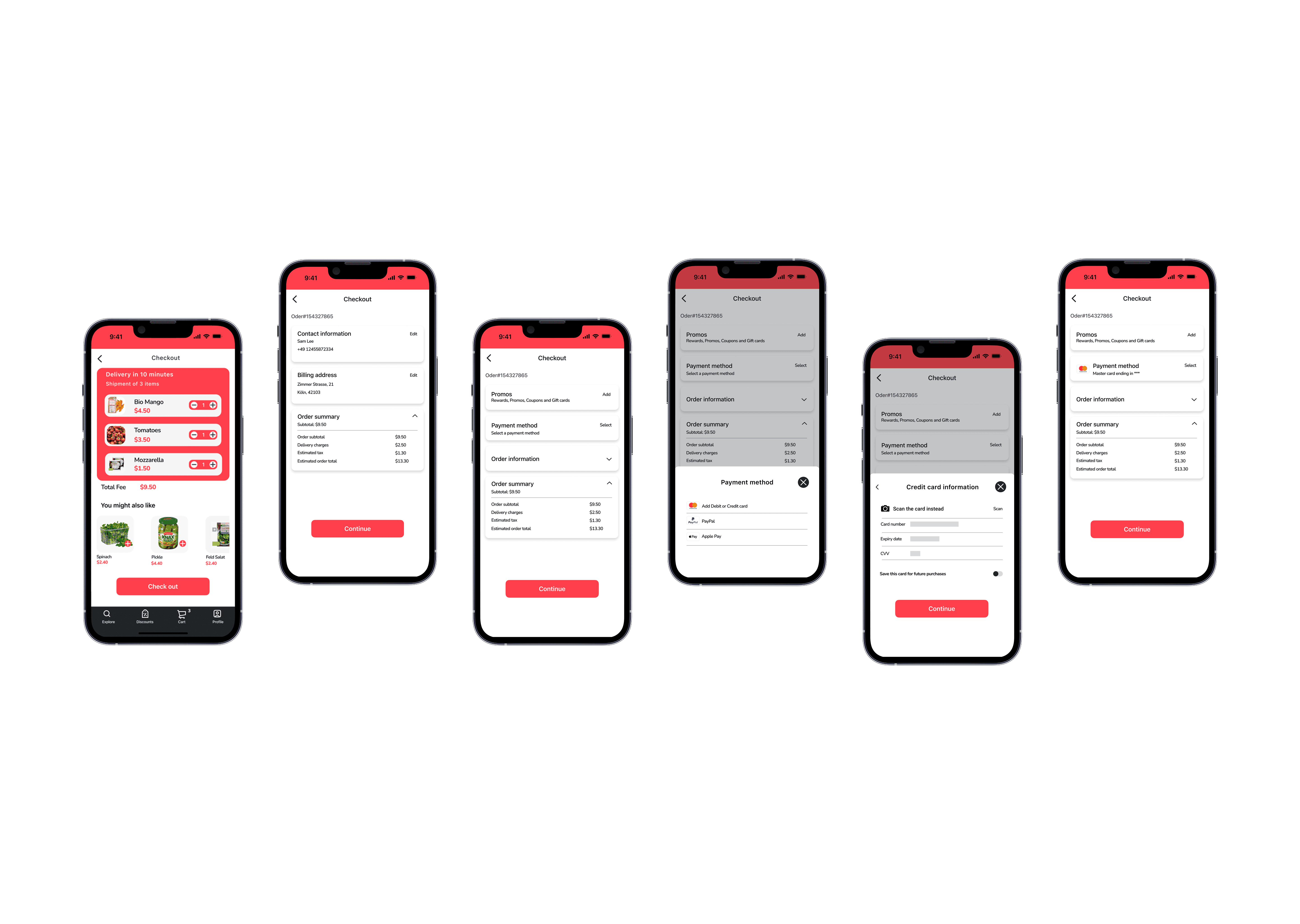
Checking out

High Fidelity Wireframes- Android
Signing Up to FreshCart

Adding items to cart
Adding payment method

Checking out

Key Takeaways
Frictionless onboarding = Higher User Retention
Social login and phone-based authentication cut sign-up steps from 5 to 3, addressing accessibility. An app that is easily accessible is used more frequently.
Predictive Navigation Drives Efficiency
Categorizing products efficiently can help reduce the browse-to-cart time.
Distraction-Free Checkout = Fewer Abandoned Carts
Auto-saved payment details increased checkout completion by 25%.
Trust Through Transparency
Trust Through Transparency Notifying users when products are out of stock and reminding them when they are in stock builds trust in the users. Trust is established when users are well informed.
Future Iterations
Enhanced personalisation
Provide users with more personalised categories depending on their buying patterns. For e.g; most bought items.
Gamification
Incorporate points and reward system which the users can redeem during future purchases. This not only retains users but will also encourage users to buy within the app.
Integrating voice search
Integrating voice search will help in reducing browsing time and in turn help to reduce browse to cart time.
Real time delivery tracking
This can be a game changer. Providing users with real time delivery status will not only build trust in users but also reduce the anxiety associated with online deliveries. The users can also plan accordingly when they are aware of when the delivery will be made.
Conclusion
By streamlining the login process, optimizing intuitive navigation, and simplifying the payment journey, this project enhances user accessibility, reduces friction, and drives higher conversion rates.