
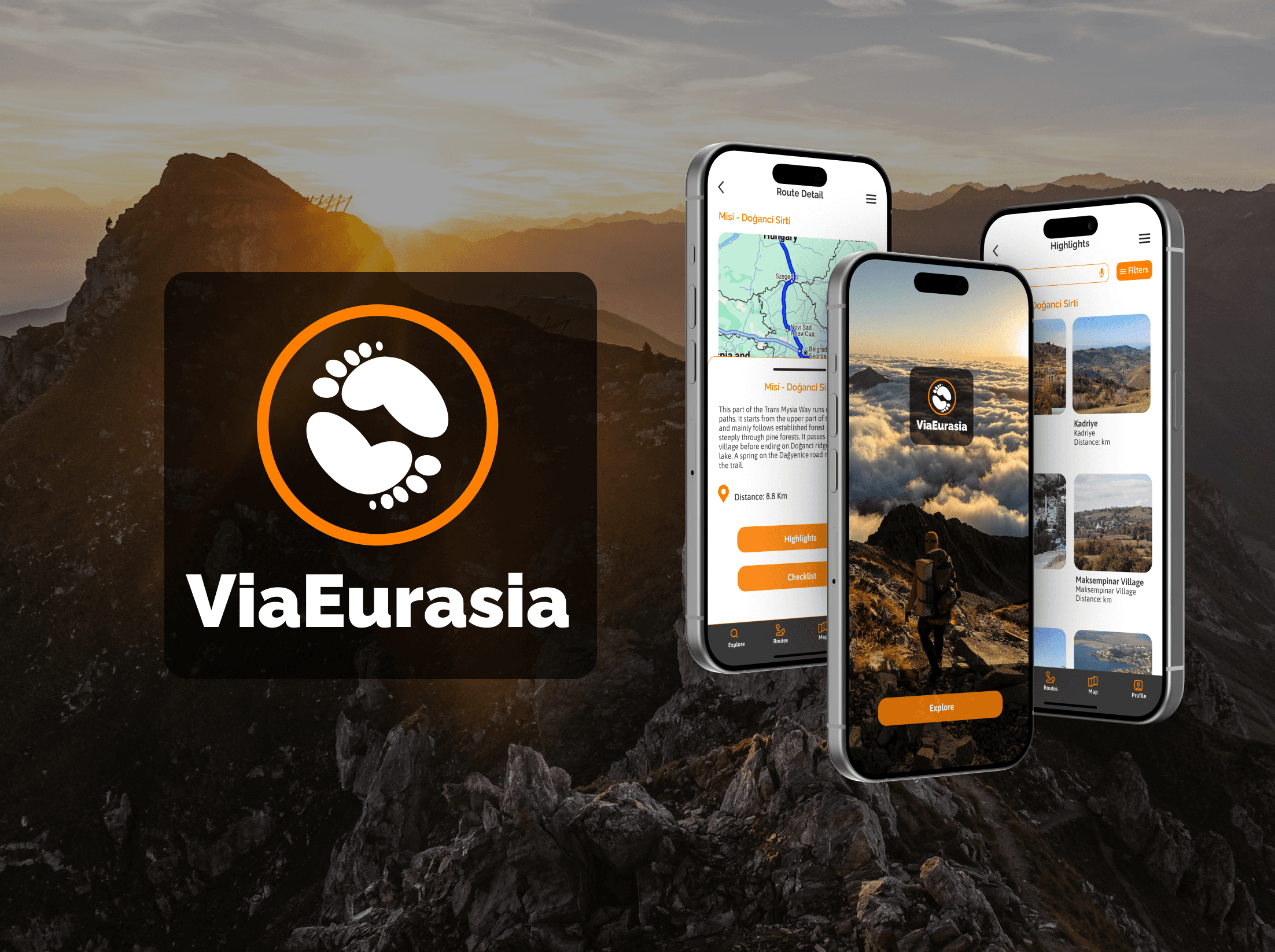
ViaEurasia- App Redesign to Enhance User Experience
Travel and Tourism
UI/UX Designer
iOS and Android
Figma
Via Eurasia is a long-distance cultural route connecting Canterbury, UK, to Demre, Turkey, and beyond. It links diverse landscapes, ancient kingdoms, and pilgrimage trails, creating a unified journey through history, faith, and nature.
As a UI/UX Designer, I redesigned the Via Eurasia app to enhance its usability, visual appeal, and functionality. The goal was to create a seamless experience for travellers exploring this ambitious route, making it easier to plan journeys, discover cultural landmarks, and navigate the trails.
Challenge
The existing Via Eurasia app suffered from an outdated UI, poor user experience, and inconsistent design, making it difficult for travellers to plan and navigate their journeys. Additionally, the app needed a fresh branding to better reflect the cultural richness and diversity of the Via Eurasia route.
This redesign aimed to modernize the app, improve usability, and create a cohesive visual identity that aligns with the route’s unique heritage.
Impact
The redesigned app features a clean, clutter-free interface, making it easier for users to navigate and access essential features.
The improved onboarding process resulted in a 35% increase in new user adoption rates.
The addition of personalization and customization options enhanced user engagement, leading to a 25% increase in user retention rates.
35%
Improved onboarding process
25%
Increase in user retention


Problem Statement
Current Issues
The existing Via Eurasia app had
A cluttered interface
Confusing navigation and
Lacks visual appeal
This was making it difficult for users to explore routes, plan trips, or access essential information. The outdated design failed to reflect the cultural richness and historical significance of the Via Eurasia route.
User Frustrations
User feedback revealed that travellers struggled to find routes, book tickets, and access detailed trail information. Many found the app overwhelming and unintuitive, leading to frustration and a poor overall experience.

Design process
Let’s take a peek into the various steps involved in arriving at the final design solution.

User Research
Hypothesis
If we simplify the navigation, modernise the visual design and improve the overall user experience, travellers will find it easier to explore routes, plan trips and access essential information. This in turn will increase user engagement and satisfaction.
Who
Travellers who enjoy hiking, trekking and exploring off-the-beaten-path destinations.
Age Group: 25–45 years old.
What
Users should be able to plan their trips with the app. The app should also provide the users navigation and guidance by providing real time directions and also provide cultural and historical information.
When
Pre-Trip: The app will be used for planning the trip.
During the Trip: For navigating to the selected places and information about the places.
Post-Trip: For sharing experience and rating the visited places.
Where
Users will be using the app at home during the planning phase of the trip and post rip to share their experiences. They will also be using the app during the trip, on the go for real time directions, information on weather etc.
Why
The app is specifically designed for the Via Eurasia route, offering detailed information about its trails, landmarks, and cultural significance. Unlike generic travel apps, it provides specialized content that enhances the Via Eurasia experience. The app provides rich cultural insights about historical sites and landmarks.
How
The app is targeting the young population at large and hence this calls for a modern logo and interface.
Provide a search button and navigation bar to make navigation simple and intuitive.
Organise the various elements in a less chaotic, modern and intuitive manner.

Synthesis
Patterns
Pre-Trip Research: Users spend time exploring routes, reading about cultural landmarks, and planning itineraries.
On-the-Go Navigation: Users rely on the app for real-time navigation, especially in remote areas with limited connectivity.
Cultural Exploration: Users engage with multimedia content (e.g., audio guides, photos) to learn about historical sites.
Community Interaction: Users share reviews, tips, and experiences with other travellers.
Post-Trip Reflection: Users track their progress, share photos, and plan future trips.
Surprises
Users are delighted to discover lesser-known trails or cultural sites they didn’t know about.
Many even prefer tailored itineraries according to their preferences.
Frustrations
Cluttered and Confusing Interface: Users find it hard to navigate the app due to too much information or poor organization.
Poor Offline Functionality: The app doesn’t work well without an internet connection, making it unreliable in remote areas.
Inaccurate or Outdated Information: Users encounter incorrect trail details, wrong distances, or outdated landmark information.
Needs
Simplified Trip Planning: Users want an easy way to plan their journey, from exploring routes to booking accommodations and transportation.
Reliable Offline Functionality: Users require offline access to maps, route details, and cultural information, especially in remote areas.
Accurate and Detailed Information: Users want up-to-date, accurate information about trails, landmarks, and cultural sites.
Engaging Cultural Insights
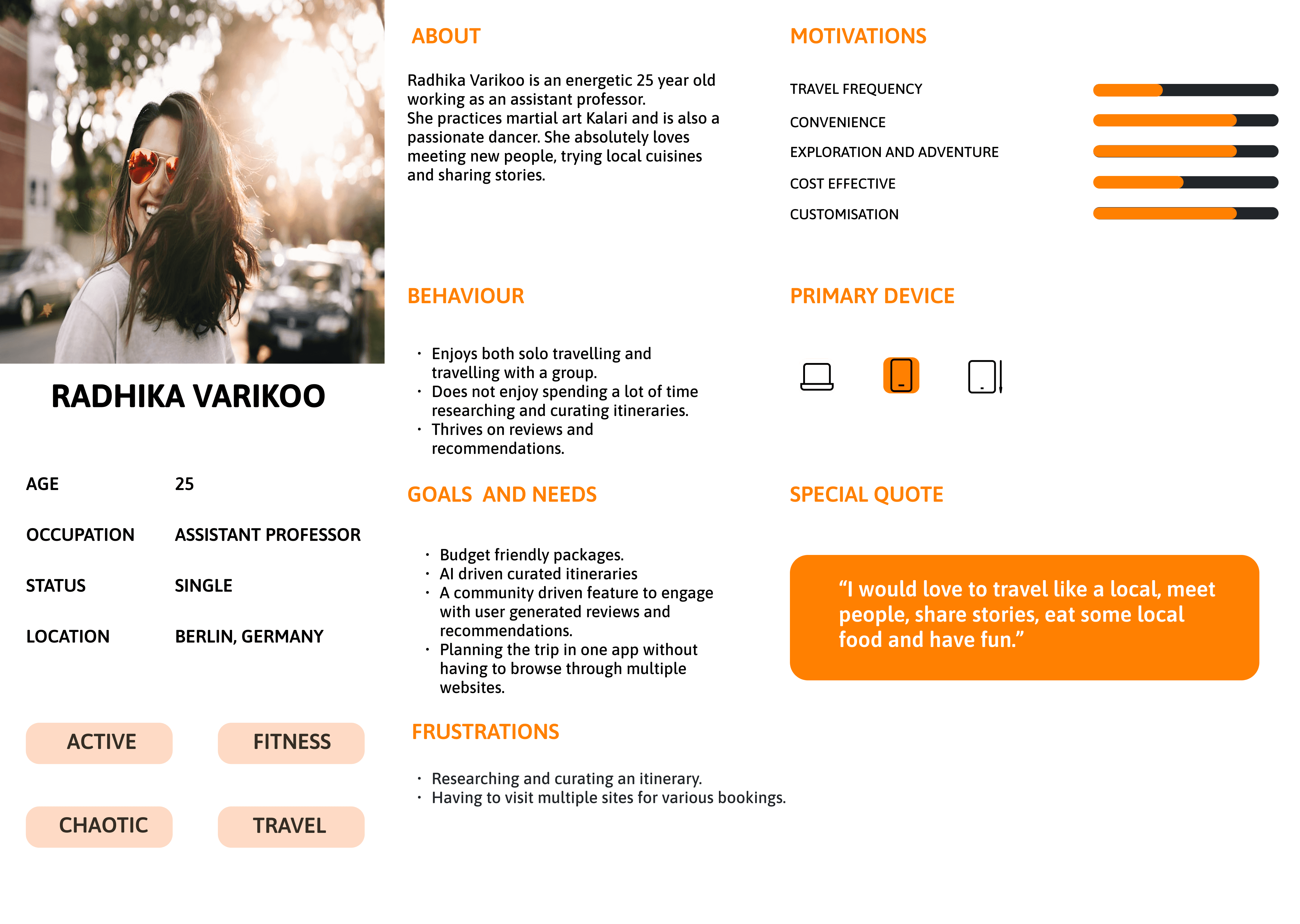
The User
User persona gives us a clearer picture of the needs of the user
Logo Redesign
The original Via Eurasia logo had a crude and outdated design that didn’t reflect the app’s cultural richness or modern aspirations. Taking inspiration from the old logo, I reimagined it with a contemporary and sophisticated touch. The new design retains the essence of the original while incorporating clean lines, modern typography, and cultural symbolism to create a visually striking and memorable identity that aligns with the app’s mission of connecting travellers to history, culture and nature.
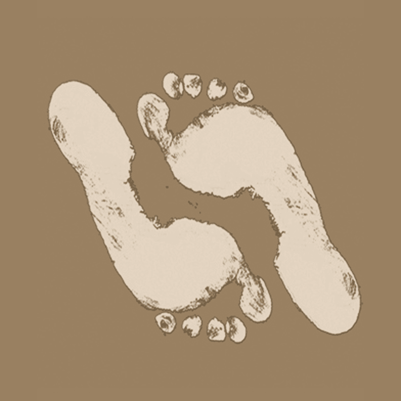

Changes made
I retained the symbol of the footprints from the original logo but redesigned it to give it a more modern and polished look.
The previous color palette had a dull and worn-out appearance, so I updated it to align with the app’s vibrant and cohesive color scheme.
To enhance the design, I added a circle around the footprints, symbolizing a path or journey while also evoking a sense of friendliness, approachability, and trust.
This new logo not only feels fresh and contemporary but also reinforces the app’s mission of guiding travellers on a meaningful and enriching journey.
Redesigning The Key Screens

Changes made
I gave the home page a modern and sophisticated look by eliminating unnecessary elements and reorganizing them into the About page. The new design features a clean and intuitive interface, offering a sleek and streamlined experience that enhances usability while maintaining a visually appealing aesthetic.
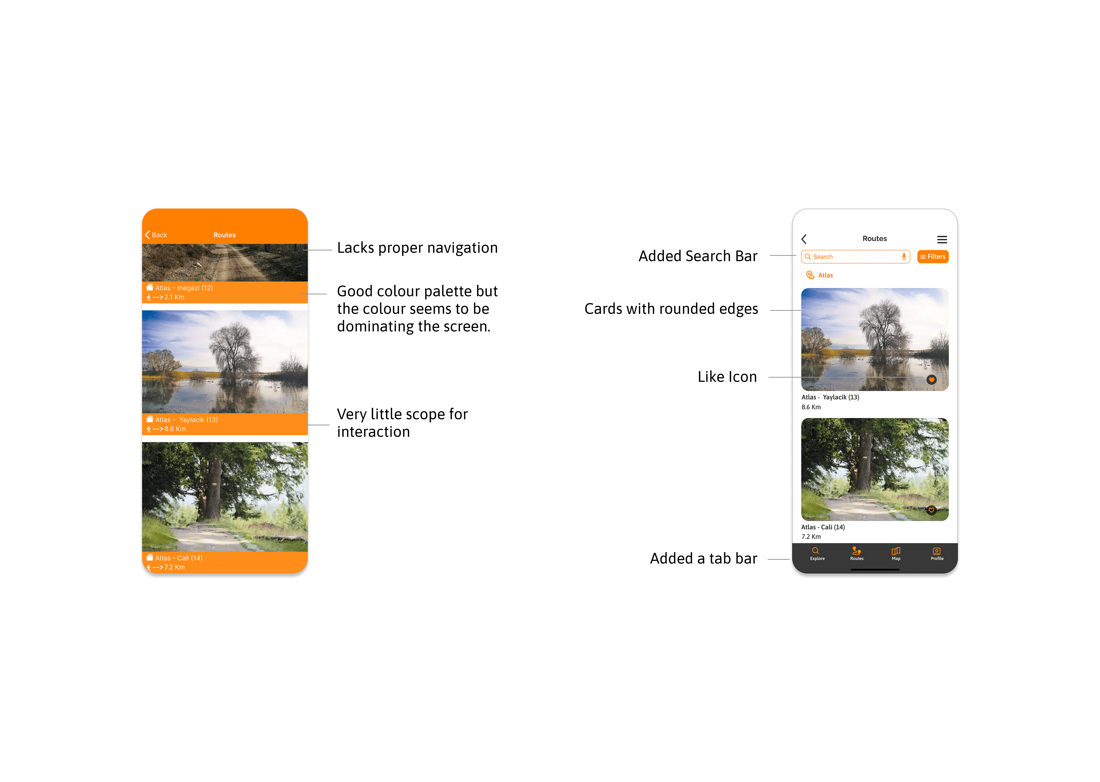
Changes made
Modern Design with Cards: Used cards with rounded edges to give the interface a modern and sophisticated look.
Refined Color Palette: Retained the old color palette but minimized the use of accent colors to create a minimalistic and clean aesthetic.
Interactive Elements: Added a like icon to enable user interaction and engagement with the content.
Enhanced Navigation: I introduced a bottom tab bar for quick access to key sections and added a search bar at the top for easy exploration. These changes create a more intuitive and user-friendly experience, allowing users to navigate the app seamlessly and find what they need with ease

Changes made
Introduced a Bottom Sheet: Added a bottom sheet to hide detailed information about a place, allowing users to enjoy a full-screen map view when needed.
Enhanced Navigation: Included highlights and checklist buttons to improve navigation and provide quick access to key features.
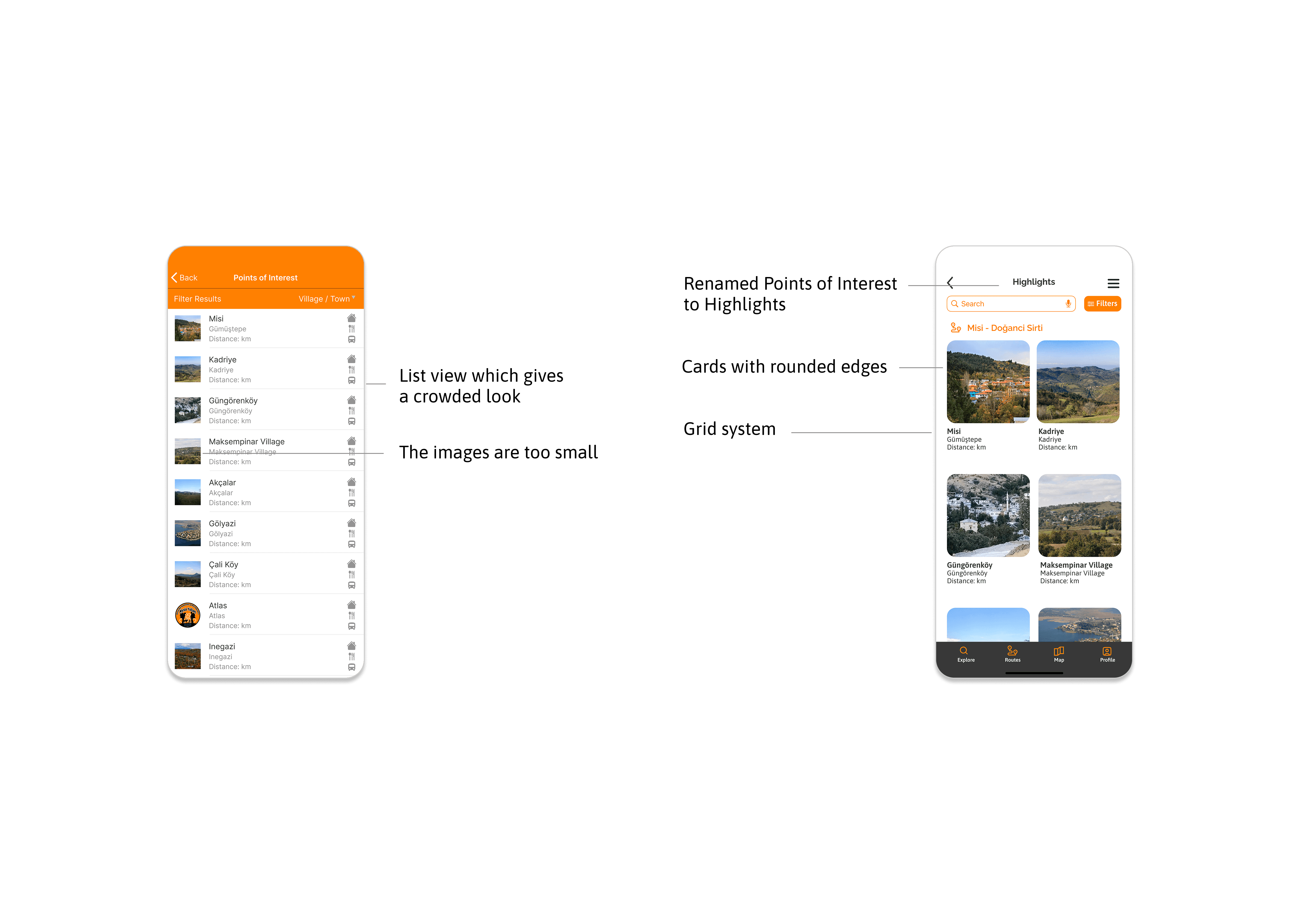
Changes made
Renamed "Points of Interest" to "Highlights": Made the label shorter and more intuitive for users.
Switched to Grid View: Changed the list view to a grid layout using cards with rounded edges, providing a clean and modern look while showcasing images effectively.
Changes made
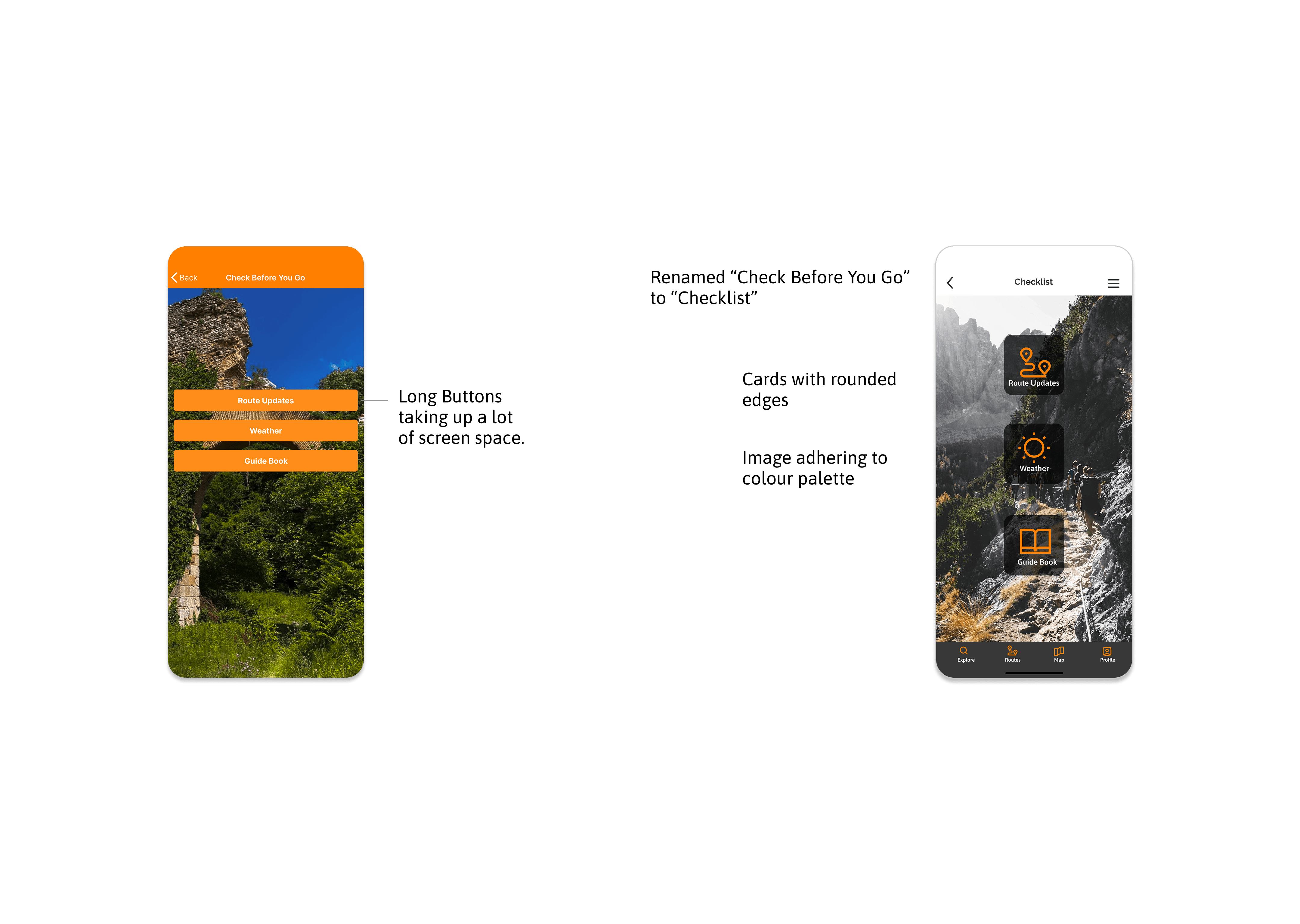
Renamed "Check Before You Go" to "Checklist": Made the label shorter and more user-friendly.
Replaced Long Buttons with Sleek Cards: Switched from bulky buttons to modern cards with rounded edges, saving screen space and enhancing the visual appeal.
Updated Images: Changed the image to one that adheres to the app’s color palette, ensuring a cohesive and polished look.
Changes made
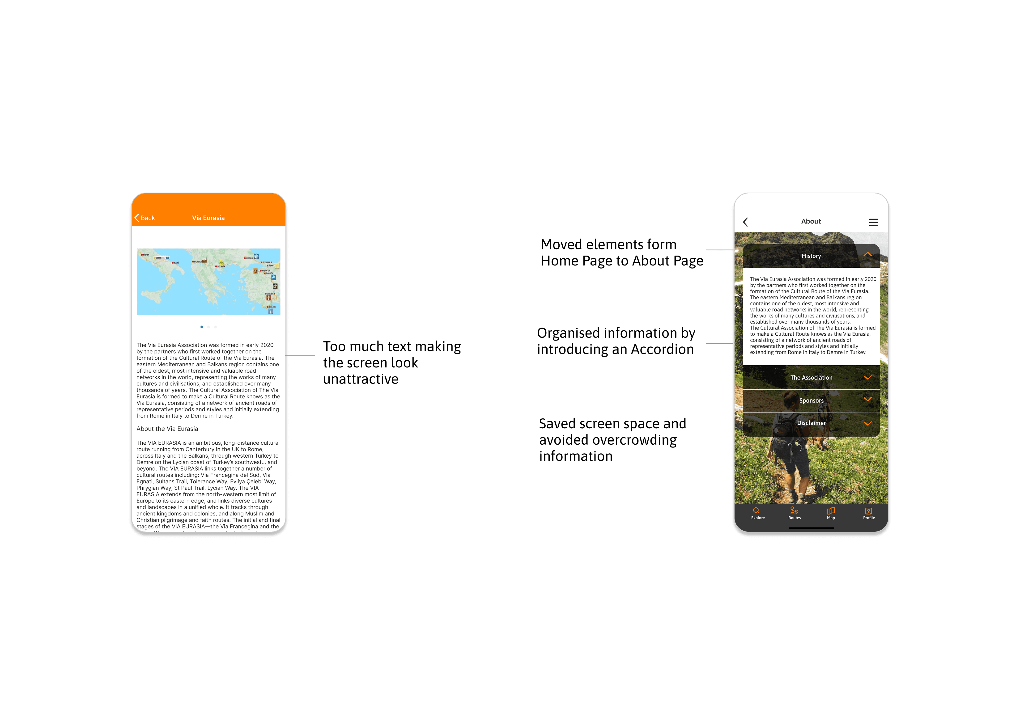
Reorganised Content: Moved elements from the home page to the About section for a cleaner and more focused interface.
Introduced an Accordion: Added an accordion component to organize information, save screen space, and enhance user control by allowing them to reveal only what’s necessary.
Updated Background Image: Included an image that adheres to the app’s color scheme and theme, creating a cohesive and visually appealing design.
Key Takeaways
Improved Navigation
Takeaway: Users found the bottom tab bar and search bar intuitive and easy to use.
Action: Ensure all key features are accessible within 1-2 taps and maintain consistent navigation patterns.
Positive Response To Visual Design
Takeaway: The modern, minimalist design with rounded cards and a cohesive color palette was well-received.
Action: Continue using clean, visually appealing layouts and ensure consistency across all screens.
Engagement With Interactive Elements
Takeaway: Features like the like button, accordion, and bottom sheet enhanced user engagement and control.
Action: Add more interactive elements (e.g., sharing options, progress tracking) to keep users engaged.
Need For Personalisation
Takeaway: Users expressed interest in custom itineraries and tailored recommendations.
Action: Introduce features like saved favourites, personalised suggestions, and user profiles.
Add Community Features
Takeaway: Users wanted more ways to connect with other travelers and share experiences.
Action: Add a community forum, user reviews, and social sharing options.
